Constructive Feedback welcome

FowlersFreeTime

Legendary Member
Site Supporter
Site Supporter
Followers
37
Following
5
Joined
Nov 19, 2020
Posts
2,782
Likes Received
2,439
Name
Chris
Country
United States
City/State
Pembroke Pines/FL
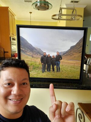
Many of my pictures from Scotland feature a dull, featureless sky, due to the weather. I know my sky was often "blown out" since I didn't see the need to preserve detail there.
This one the scene was decent, sky was gray but not too foggy, and dammit I wanted a family portrait in Glen Coe no matter what LOL.
How would you have edited this or what would you change?

Family_GlenCoe_medium.jpg
  • ILCE-6400
  • E 17-70mm F2.8 B070
  • 17.0 mm
  • ƒ/8
  • 1/60 sec
  • ISO 100

photoshop elements edit.jpg


Picture was taken on a tripod with a remote shutter, I think exposure time was ok, and despite the wind there shouldn't have been too much camera shake.
I'm here to learn, so if you have feedback on how to improve the edit or what I could have done in camera to take a better picture, I'm all ears. Be gentle LOL
 
Last edited:
I don't know but I kind of like it. What can you do with a gray, lifeless sky?? You could have done a narrow depth of field shot and tried for Bokeh but that is not the right place. Pretty cool geography there. Be pleased that you got to go there.
 
Personally I wouldn't change a thing. I really like the composition and you've recovered just enough detail from the sky so that it doesn't look over processed. That's a nice day for Scotland :)
 
Personally I wouldn't change a thing. I really like the composition and you've recovered just enough detail from the sky so that it doesn't look over processed. That's a nice day for Scotland :)
Aye, one of the few days when it didn't rain on us! 😅
 
It looks pretty good as-is, to your credit. However, if we're going to have a critique forum, then in keeping with the spirit:

The three things I notice are the haziness of the mountains, the need for some more contrast due to the flat light and haze, and the dark clothing. I don't know which modules you'd use in whatever program you have (is that Lightroom?), but in Darktable I would:

Try Haze Removal to reduce the background haze. Don't remove it all, it would look odd due to the light.
Use Local Contrast to bump the contrast a touch. Maybe clarity?
Use Tone Equalizer to bring up the brightness in the clothing just a smidge. Not much, just a teeny bit to show some more detail. You may want to use a mask and a tone curve on just the clothing.

None of these adjustments would be much, just play around and see what happens.

One other comment, the general recommendation is to use a dark theme when editing. Using a background brighter than your image can be distracting and cause you to make the image too bright because your eye adjusts for the lighter/brighter area around the photo. I did download it and brighten it a touch, I thought the result was positive. Again, not much.
Thanks Tim. I'm using Adobe Photoshop Elements, but I also have Capture One Express (free Sony version) at my disposal.
I will try a touch more contrast and a bit of dehazing, though that haze might be physically there due to atmospheric conditions.
One thing that Elements does not seem to have in comparison to the full blown Photoshop (or LightRoom) is the ability to to graduated or selective editing. Maybe I have more to learn (probably) or maybe they just kept everything a global adjustment to simplify this software for newbies and cheapskates like myself LOL.

You're right about Dark Theme/Mode. I use it whenever possible.

I will probably crop this to 8x10 and print it for my parents as I should see them this weekend.
 
I think that's a beauty! You have come up with a pretty natural look right there. I like the fence running on the angle behind you guys as well. I wouldn't feel the need to make any changes if I were you. The sky looks perfect as it doesn't remove any attention from the people and the lovely scene.

Great image and a fantastic memory for everyone there as well. 😊
 
Just want to say thanks everyone for the input. I ended up printing this after all, and its my first print from my Sony camera.

20220806_180820.jpg

That said, I chose poorly when it came to material: Canvas sucks 😅
You lose too much detail printing on canvas, I think the texture would have benefited a more abstract photo. Now I know for next time.
 
In sticking with Chris's title, I am struggling to photograph this bamboo lined trail. I have tried HDR, 20mm, 35mm, 85mm and 100-400mm focal lengths. I cannot seem to give the shot the creative image that I see when I walk here. Suggestions please. Thanks!
20230228-DSC08380-HDR.jpg
  • ILCE-7M4
  • FE 20mm F1.8 G
  • 20.0 mm
  • ƒ/8
  • 1/15 sec
  • ISO 1600
 
I like the angle mate. I think the 20mm or the 35mm with the camera basically on the deck though. I love the shots where it calls for the camera to pretty much be touching the ground. 🙂
 
In sticking with Chris's title, I am struggling to photograph this bamboo lined trail. I have tried HDR, 20mm, 35mm, 85mm and 100-400mm focal lengths. I cannot seem to give the shot the creative image that I see when I walk here. Suggestions please. Thanks!View attachment 33970
This is a nice picture as is, the angle allows the bamboo to look vertically straight and the exposure is good.

I think Clint and I are thinking the same thing though: if you take that 20mm closer to the ground and angle up, it will accentuate how the bamboo towers over the photographer. I discovered this in Japan when I was in the bamboo forest, but there were so many tourists, I had to angle up to avoid including them in the scene. Of course if you do this, the sky might be too bright, so perhaps at that point, HDR bracketing will help even out the lighting. Cheers!
 
I don't think I'd angle it up much mate, that's why I suggested the 35mm. I'd run it along the ground taking all that immediate texture into the image then hopefully that focal length is enough to minimise that sky.
 
Thanks Chris and Clint. I will get further down to the ground. The issue is the path is running down hill and the bamboo is very tall, so a challenge to capture that relationship. Of course, one of the great advantages of digital is I can experiment with as many focal lengths and angles as I want. I really like the idea of the bamboo towering over the photographer, I will give it a try. Thanks again for the suggestions. Best!
 
The path looks too wide right near the camera. Also, I don't want to see the open end of the trail in the shot. Leave a little mystery, let the viewer wonder where it goes. Remove the trail sign.

Just for the heck of it (Since you're going back anyway) try a much narrower lens to make the shot more intimate. Start your shot further down the path so it doesn't look so open. Compose it so the path starts at one of the lower corners of the frame and disappears into the image so the viewer is drawn in. This is where a zoom can really help. You can set up and play with the FOV until it has the feel you want.
Tim, very good explanation of what I want to achieve with the photo. When I stand at the entrance which is well above the exit there is a mystery to the scene. This is unedited shot, not in focus and exposure is not correct. If I move further back and to the right an get closer to the ground, that might do it. I soot it with a hint of light at the exit and no light and compare. Thanks, gentlemen, for your creative composition ideas. I will take a walk tomorrow and give it a go.
20230103-DSC05301.jpg
  • ILCE-7M4
  • FE 85mm F1.8
  • 85.0 mm
  • ƒ/2.5
  • 1/50 sec
  • ISO 320
 
Second shot is much better composition-wise. I also like the darker look. You could almost just burn the little bit of bright light at the end of the path, so it isn't as prominent.
Thanks. I have already taken many photos of that trail. I want to go back out and look at the scene with a fresh perspective based on the thoughts shared here.
 
Tim, very good explanation of what I want to achieve with the photo. When I stand at the entrance which is well above the exit there is a mystery to the scene. This is unedited shot, not in focus and exposure is not correct. If I move further back and to the right an get closer to the ground, that might do it. I soot it with a hint of light at the exit and no light and compare. Thanks, gentlemen, for your creative composition ideas. I will take a walk tomorrow and give it a go.
View attachment 34003
Hi, Clide,
My first thought when looking at your first photo, was to ask at what height you took it. Like others, I wondered how it would look if you put the camera at or near ground level. Looking at this second photo, I wonder what would happen if you shot it from the other end, facing the entrance. You'd lose the sign that says "Trail," but I wouldn't consider that a loss.
Thanks ST, I have shot it forward and backwards, from 20mm to 400mm on and off a tripod. I went on the internet and found that Clint's, Chris's and Tim's thoughts were dead on in some way composition wise. It's seems all the authors on internet ideas are finishing the creative photos in PS. They are also taking the photo low , hi, sideways, pano, HDR, HDR pano, sunrise, sunset and everything in between. Not one shot may give me what I want. I am going back out there with all your ideas and see what I can create that would be interesting for the viewer. This is one of the shots I took looking up the hill towards the entrance. The reality is I may already have the photo and have to clean it post production just like Tim suggested. The photo will be a group effort! Thanks
20230228-DSC08393.jpg
  • ILCE-7M4
  • FE 20mm F1.8 G
  • 20.0 mm
  • ƒ/8
  • 1/15 sec
  • ISO 3200
 
Photoshop a tiger in there?

I love bamboo and it surrounds my apartment building as a filter from neighboring apartments. I love the sound of wind blowing through it and the way it arches when wetted. Most of all I love it as a backdrop to the birds that find their way into my courtyard.
 
Thanks ST, I have shot it forward and backwards, from 20mm to 400mm on and off a tripod. I went on the internet and found that Clint's, Chris's and Tim's thoughts were dead on in some way composition wise. It's seems all the authors on internet ideas are finishing the creative photos in PS. They are also taking the photo low , hi, sideways, pano, HDR, HDR pano, sunrise, sunset and everything in between. Not one shot may give me what I want. I am going back out there with all your ideas and see what I can create that would be interesting for the viewer. This is one of the shots I took looking up the hill towards the entrance. The reality is I may already have the photo and have to clean it post production just like Tim suggested. The photo will be a group effort! ThanksView attachment 34005
I like this shot, its exactly what I was thinking of.
 
It's a nice image that second one, but I can't help but feel like this is the photography 101 style of this scenario. Just like the boat jetty in the centre of the image looking out to the ocean composition.

The first thing I do when I come across these types of scenes is think about how most people would take this photo, then I try to come up with an idea completely different than that. Admittedly, occasionally the 101 style image turns out to be the best composition for it though. But I will do absolutely everything in my power to be sure of this before I come to that conclusion.
 
There's a reason they're typical, just like there's a reason the golden ratio works, and the rule of thirds works. It sounds like he's taken dozens of photos of this pathway, it'll be interesting to see the end result.
Thanks guys. Still working on it. The weather here not cooperating, been back out twice, improvements made.
 
Photoshop a tiger in there?

I love bamboo and it surrounds my apartment building as a filter from neighboring apartments. I love the sound of wind blowing through it and the way it arches when wetted. Most of all I love it as a backdrop to the birds that find their way into my courtyard.
Gaz, No tigers here. Will an out of focus guy walking his dog do?
20230313-DSC09167-2.jpg
  • ILCE-7M4
  • FE 35mm F1.4 GM
  • 35.0 mm
  • ƒ/8
  • 1/8 sec
  • ISO 250
 
Gaz, No tigers here. Will an out of focus guy walking his dog do?

I bet this guy who walks his dog there everyday would think that you live there mate. He is probably wondering where abouts you have the tent set up... 😄
 
I bet this guy who walks his dog there everyday would think that you live there mate. He is probably wondering where abouts you have the tent set up... 😄
We had a really nice chat. His dog is beautiful, wish I had taken a picture of him. Had my coffee mug camera bag and tripod set up, had the trail blocked! Very bad light today, waiting for the light to come in from the left.
 
We had a really nice chat. His dog is beautiful, wish I had taken a picture of him. Had my coffee mug camera bag and tripod set up, had the trail blocked! Very bad light today, waiting for the light to come in from the left.

I love the commitment mate. Fantastic stuff! 🥇
 
Clide,
I like the feel and simplicity of this one.
This bamboo lined trail is going take me a while to get the image or images I am looking for.

I have a piece of driftwood that I photograph almost every day. It changes with the weather.

I'm not looking for perfection; just appreciating the differences.
 
You could put all these up on your wall if you wanted to mate. They're all solid images. 🙂
 
This bamboo lined trail is going take me a while to get the image or images I am looking for.
I like this last one for the weight of the bamboo in that it feels more even between the sides. This one does feel a little claustrophobic and I think that is because the bamboo trucks are visible near on the right and left. I think a crop more like this in which you have the path to the edge of the frame (red circled area) gives the image more of a feel of a path to follow rather than a tunnel to escape. To me at least this makes the feeling of the image match the sense I get from the coloring of the image. That may not make a lot of sense but not sure how else to word that.
Screenshot 2023-03-18 081935.jpg


It kind of also feels like it might be missing something, not sure what but something. I kind of would like to see what it would be like with a grandfather (in like earth tones) and granddaughter (maybe in something floral) holding hands walking down the path 2/3rds of the way (might be a lot to ask for). That might not work at all but that is what pops into mind.
 
Back
Top